
About the Project
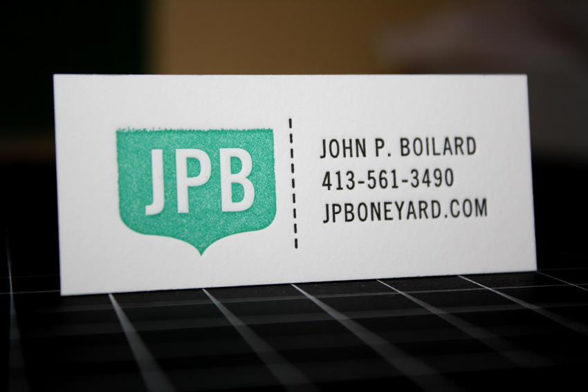
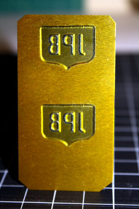
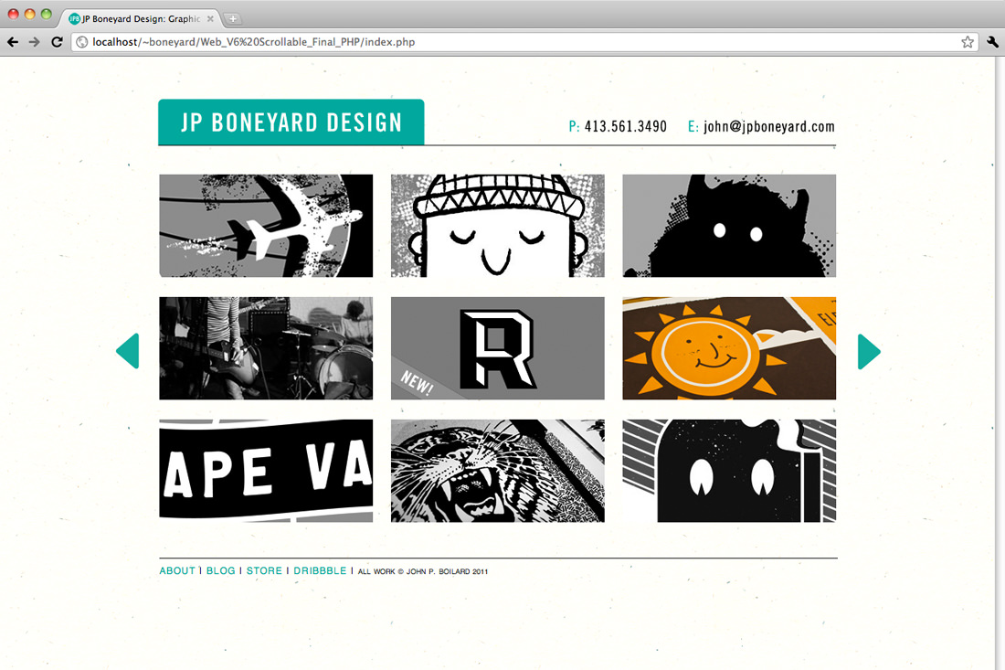
Most designers would agree, no matter how good you are at what you do, it's still hard to design for yourself. I aimed to keep my personal identity and portfolio site as to the point, fun and functional as possible. Trade Gothic (late 40's American typeface, hard working, reliable) and I have the most in common so we've decided to partner up. We thought about bringing teal into the mix because it's both vibrant and light hearted. Add a brayer and some acrylic ink, and you've got JPB. Big thanks to Mike Swartz for the rad web design class and Manifesto Letterpress for the great print job on the business cards.